On the web, the experiences we design and create for our online users may have inadvertent barriers for those who may also have different kinds of disabilities – including impairments to auditory, cognitive, physical, visual and speech.
Disabilities can range from permanent to temporary. A person who was born without the use of their left arm has mobility impairments just as someone who has recently broken their arm and is in a cast.
So what do we mean by accessibility? It is the ability of someone with an impairment of any kind to have the same exact experience and access as anyone else. We measure that in a variety of ways, including what is known as the “human impact”. This impact is the experience an impaired user would experience with the use of Assistive Technologies (AT), such as screen readers, braille readers, and text magnifiers.
Accessibility is defined as “the design of products, devices, services, or environments for people with disabilities.” This practice ensures that everyone is able to access content on the web (such as text, electronic documents, and multimedia) both directly (without assistance) and indirectly (through assistive technology such as screen readers).
![]()
SO WHY DO WE NEED IT?
A few reasons.
First, we live in a world where the web has become an integral part of our day to day lives. We use it a great deal for education, employment, government, commerce, health care, recreation, and so on. The web needs to be accessible to everyone in order to provide equal access and equal opportunity to people with disabilities – because people with disabilities are legitimate, contributing members of society. Taking disabilities into account when creating and designing web experiences, allows everyone to participate more actively in society.
Secondly, making an experience easy and accessible also means it’s easier to do business with many people who might have a disability. For instance, for those with limited mobility it can eliminate the need to travel for meetings or for shopping; it can enable those with limited vision to consume your content; it can enable those with hearing impairments to communicate with you without the use of a telephone.
Third, it’s also a legal matter. While we understand that we should be making web experiences accessible, it’s often something that is overlooked. Most countries have some kind of legal standard around accessibility requirements. The US has the Americans with Disability Act (ADA, section 504 & 508), the ACAA Air Carrier Access Act, and the Communications and Video Accessibility Act (CVAA). These federal accessibility guidelines detail the web accessibility rules to which companies must comply. Companies that aren’t compliant run the risk of legal action being brought by members of the public and even human rights associations.
It’s important to note that anyone can be sued for non-compliance, not just companies. Names such as Beyonce, Nike, Converse, Faberge, Timex, Hershey’s, the Wall Street Journal, CNN, Rolex, and Amazon were all sued for millions of dollars for not ensuring the same experience on their platforms for all users.
Additionally, if you are doing business with the government, you are legally required to have 508 compliance.
WHAT NEEDS TO BE DONE FOR A SITE TO BE CONSIDERED ACCESSIBLE?
Here are some of the most common issues and considerations for making your website accessible to all.
 Navigation. This is important whether or not a user has a disability. If your navigation is not well designed and easy to understand, then people will not be able to find and access all of your content. Two things to think about for accessibility:
- Tab through order: For those who may not be able to use a mouse and rely solely on their keyboards to navigate through a site, the tab button becomes critical for moving through different sections of a web page. Accessible websites should be built and structured so that pressing the “tab” key will logically move the user from the address bar to your website’s menus, across form fields and links, and to any other content areas. This tab order should be one that is intuitive and easy to follow.
- Landmarks: Just as landmarks help us orient and navigate through physical space, they are just as important when navigating through digital spaces. Digital landmarks are special labels included in the site code that provide navigation indicators. They will, for example, allow those using screen readers to quickly identify the page’s navigation menu and access it without having to listen and parse through all of the text on the page.
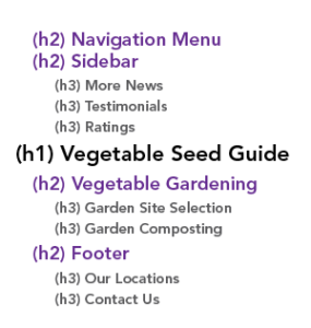
- Structure. A website with good structure is one that uses hierarchical formatting and has logically named headings and information. This clearly shows therelationships between different areas of content on a page. Without visual impairment, a person can scan the page quickly looking at titles and headings. Without those visual cues, however, someone using a screen reader should have no trouble getting similar key information from your website, if it has been structured well.
- Pages should all be given a logical and unique title, so that no two are the same.
- Headings should be clear and logically progress through the content. On the code side, headings should be formatted hierarchically using heading style designations such as “Heading 1”, “Heading 2”, and so on, so that a user doesn’t have to rely on the visual traits of these elements in order to understand the structure.
- Text. Roughly 2% of adult Americans have some form of vision impairment, including nearsightedness, color blindness, or even complete loss of vision. Considerations such as text size, contrast, and color can significantly improve how easy it is to read your content. For example, users should be able to increase or decrease the text size on your site using basic browser functionality. Additionally, proper color contrast between text and backgrounds will reduce visual comprehension challenges brought on by color blindness and other conditions.
- Images. Using imagery to convey a great deal of meaning in a design can prevent the visually impaired from being able to receive that information. Some things to consider:
- Important information should be displayed as text and not as an image wherever possible.
- Include text descriptions on your images so that vision-impaired users can understand what is being displayed. This is especially important for graphics such as flowcharts, schematics, maps, graphs, or menu buttons.
- Color shouldn’t be used to convey important or critical information – for example, a map that uses color-coded markers. To assist people with color blindness or other vision impairment, supporting text should be included.
- Hyperlinks. Hyperlinks are a main feature on all websites, used to allow for easy navigation to other pages and websites for additional details and information. However, people using screen readers experience hyperlinks differently, and improperly named links give no additional information or context for the user to know what to expect when they access it. Links titled “read more” are a common example of this issue.
- Where possible, hyperlinks should use common words and language in them instead of just stating the web address. Listening to a hyperlink on a screen reader that is made up of a string of letters and numbers is not only arduous, but again gives the user no context or understanding of what to expect by clicking on it.
- Links should also be easy to distinguish (beyond just being a different color). Italicize or underline them so that they are easy to identify as hyperlinks.
- Forms. Forms are often prominent features for government and non government websites, so it’s important that they be accessible. Forms should always:
- Follow a logical tab-through order to get through each field within the form
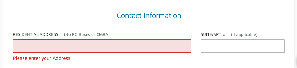
- Have form fields, checkboxes, or dropdown menus that are clearly labeled and are readable by screen readers.
- Allow a user to extend the time before a page times-out, so that they can complete the form when necessary. Time outs are a security feature on many forms, but can leave users with insufficient time to get through the form if using screen readers or navigating by keyboard.
- Error messages should be clearly marked. For form validation errors, the messaging should be in close proximity to field that was incorrectly filled (or skipped), and should clearly describe the issue so that the user can remedy.
- Follow a logical tab-through order to get through each field within the form
- Multimedia. Captioning and transcripts can provide synchronized text when consuming video or audio file. Animations and movement should include a means for the user to disable or pause them.
Creating web experiences that everyone can experience is the right thing to do, for many reasons. It means enabling people who experience disabilities to more actively participate in society. It’s a legal requirement. It also means potentially growing your reach & expanding who you can do business with.
![]() Ultimately, though, it’s the right thing because it improves the experience for ALL users, not just those who are disabled. Studies have demonstrated that accessible websites have higher rates of task completion and comprehension for users who do not have a disability, in addition to those who do.
Ultimately, though, it’s the right thing because it improves the experience for ALL users, not just those who are disabled. Studies have demonstrated that accessible websites have higher rates of task completion and comprehension for users who do not have a disability, in addition to those who do.
If you’re unsure of whether or not your website is complaint, contact Pixelstrike Creative for an audit. We’ll review your website for accessibility compliance from 508 to WCAG AA, and provide you with a report detailing all of the found issues by severity, so that you can better understand how users with disabilities experience your site. We can then work with you on code fixes to ensure your site is set up for all users, and ultimately for your success.
For more information on accessibility and compliance, visit: