

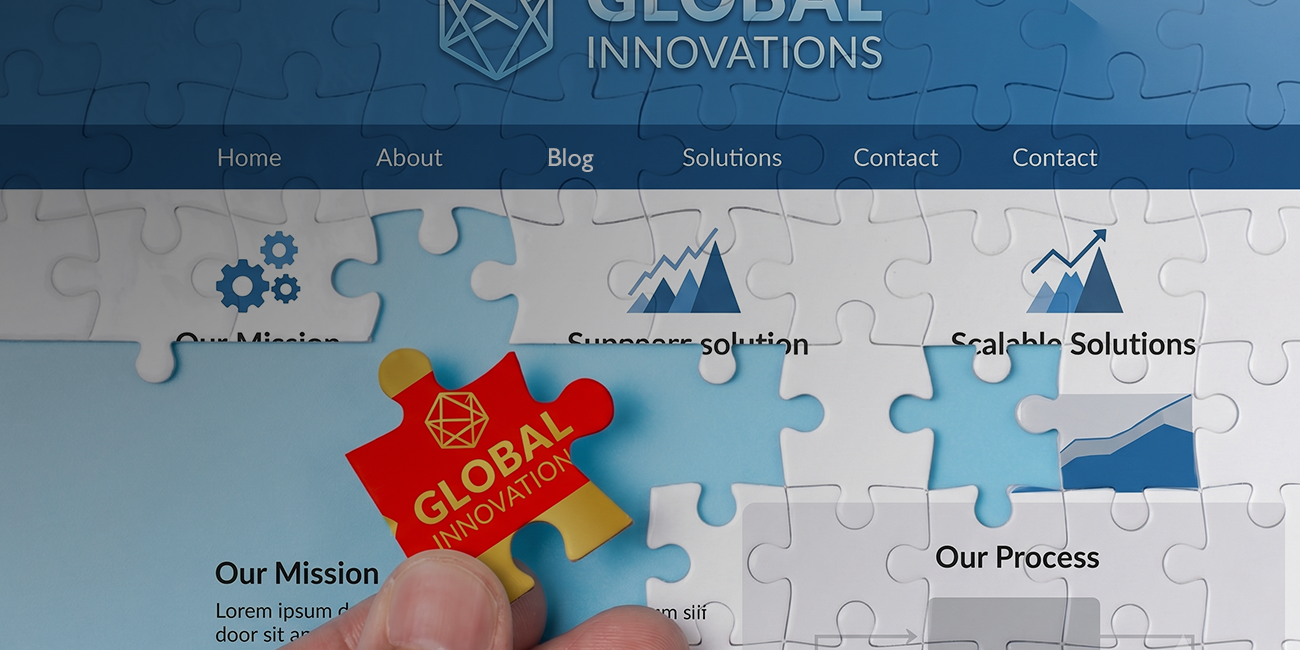
You spent time building your brand. The logo feels like you, the colors are sharp, the messaging strikes the right chord. Then someone clicks over to your website and lands somewhere that feels like a different company entirely. Older fonts, a color that’s almost but not quite right, a tone that reads stiffer than the brand you worked so hard to build.
That gap is very common, and customers pick up on it faster than you’d think. When your web design and branding tell two different stories, visitors feel the friction even if they can’t name it. We’ll walk you through why the disconnect happens, how to spot it, and the steps that bring everything back into one clear, consistent impression.
What Brand and Website Cohesion Actually Means
Cohesion is simple to describe and easy to lose. It means the colors, typography, imagery, and voice a person experiences through your logo or on social media are the same ones they meet on your homepage, your blog, and your contact form.
Think of your brand and your website as two halves of a single introduction. The brand sets the expectation. The website has to deliver on it. When those two align, a visitor moves through your site without a single jarring moment. When they don’t, every mismatch chips away at the impression you built. Strong brand design only pays off when your site carries it forward.
Signs Your Brand and Website Are Out of Sync
Some disconnects are obvious. Others hide in plain sight until you go looking. Here are the ones we see most often:
- Color drift. Your brand palette says one thing, but buttons, headers, and backgrounds on the site pull from an older or slightly off version.
- Font mismatches. The typeface in your logo and marketing materials aren’t complementary, and the two feel unrelated.
- A voice that shifts. Your social posts sound warm and human while your website copy reads formal and dated, or the reverse.
- A refreshed logo on a stale site. You updated the brand but never touched the website, so the new mark sits on top of an old design.
- Inconsistent imagery. Polished, intentional photos in one place and generic stock images in another.
If two or three of these sound familiar, your site and brand are likely working against each other.
Why the Disconnect Happens
This rarely comes from carelessness. It usually comes from timing.
Often the website was built first, before the brand fully matured, so the site reflects an early version of the company that no longer fits. If AI is used to create different elements of the site, it can distort your brand the same way it sometimes adds fingers to an altered family photo. Sometimes different vendors handled each piece — a branding studio for the identity, a different agency to design the website, a separate developer for the build, with no one making sure everything aligned. And sometimes the brand simply evolved. You refined your voice, updated your look, sharpened your positioning, and the website quietly fell a step behind.
None of these are hard to fix once you see them clearly. The point isn’t to assign blame. It’s to recognize that a disconnect is a normal stage of growth, not a permanent flaw.
What Cohesion Looks Like When It Works
When your brand and site move as one, the experience feels effortless from the visitor’s side. The colors on your homepage match the business card they were handed. The voice in your headline sounds like the person they spoke with on the phone. Every touchpoint reinforces the last, and that repetition is what builds recognition and trust over time.
This consistency does real work. It tells prospects you pay attention to detail, which they’ll assume extends to how you treat your clients. It makes your business easier to remember and removes the small doubts that quietly cost you conversions. First impressions carry a lot of weight, and the way branding shapes customer perception doesn’t stop at the logo.
How to Close the Gap
Bringing your brand and website back together doesn’t require starting from scratch. It requires a clear sequence.
Start with a clear brand foundation
Before you touch the website, make sure the brand itself is settled. Your colors, typography, voice, and core messaging should be documented and final. If any of that still feels loose, that’s the place to begin. A solid brand identity and strategy becomes the reference point everything else measures against.
Audit your website against it
With the brand locked in, go through your site page by page and mark every place it drifts. Check colors against your palette, fonts against your type system, and copy against your brand voice. It helps to know what a strong site should include in the first place, and our guide to what makes a good website is a useful checklist to hold your pages against.
Align design and content together
Fix the two sides in tandem, not separately. Updating visuals while leaving old copy in place just creates a new mismatch. The most reliable path is custom website design and development that treats your brand guidelines as the blueprint, so the finished site and your identity read as one. Our website design and development work is built around exactly that alignment.
Bringing It All Together
A disconnect between your brand and your website isn’t a crisis. It’s a signal that your business has grown and your site needs to catch up. Once you see the gaps, closing them is a matter of grounding the site in a settled brand and rebuilding the pieces that fell out of step. Thoughtful custom website design and development turns two competing impressions into one, and that single, consistent presence is what people remember when it’s time to choose.